
![]() Via Nancy LeTourneau, I came across a Bloomberg article reporting that wage growth is on fire: “The median U.S. worker saw pay rise by 3.9 percent year-over-year in October, the fastest rate of growth since November 2008.” This was based on the Atlanta Fed’s Wage Growth Tracker, which was new to me. It’s an interesting measure because it compares actual individuals 12 months apart to see how fast their wages are growing. The chart on the right shows the cheery news.
Via Nancy LeTourneau, I came across a Bloomberg article reporting that wage growth is on fire: “The median U.S. worker saw pay rise by 3.9 percent year-over-year in October, the fastest rate of growth since November 2008.” This was based on the Atlanta Fed’s Wage Growth Tracker, which was new to me. It’s an interesting measure because it compares actual individuals 12 months apart to see how fast their wages are growing. The chart on the right shows the cheery news.
That got me curious about how this compares to other, more conventional measures. My favorite is hourly wages of production and nonsupervisory employees, which gives a good sense of how working-class and middle class folks are doing. I was also curious about what these numbers would look like after adjusting for inflation, since raw wage growth figures don’t really tell you anything. Here’s the answer:
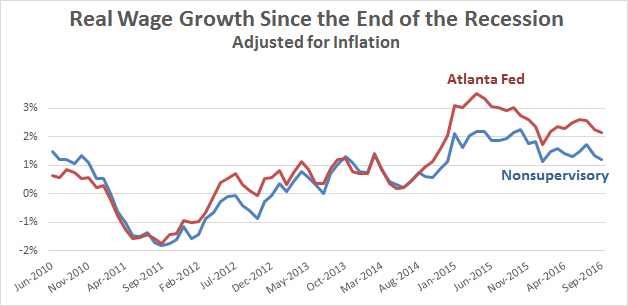
Real wages did rise at a pretty good clip during 2014 and early 2015, but the growth rate tapered off after that. There hasn’t been the nonstop upward growth that the raw Bloomberg chart shows. What’s more, in 2014 the two series began to diverge. Overall wages have risen at a rate of 2-3 percent over the past year, but blue-collar wages have grown at only 1-2 percent. That’s not too bad, but it still means that working-class folks aren’t seeing as much improvement as everyone else. That might be pertinent to our recent election results.