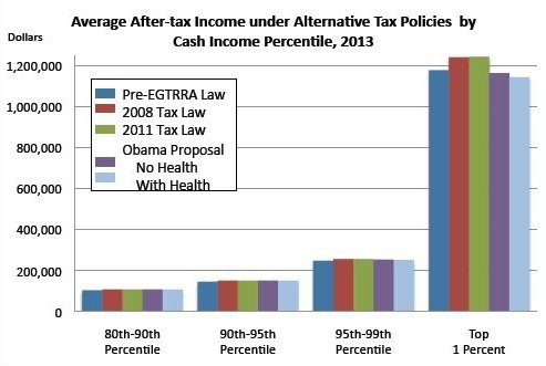
It’s Greg Sargent Day here at the blog! Today he posts a chart that was worked up for him by the Tax Policy Center. The question it answers is this: if you applied various tax policies to estimated 2013 income, how would different income groups fare? Here’s the answer for the very tippy top of the income spectrum:

The dark blue bar at the left represents Clinton-era policies. The light blue bar at the right represents the effects of healthcare reform plus Obama’s current set of tax proposals: Letting the Bush tax cuts mostly expire for the rich, limiting the value of itemized deductions and some exclusions to 28 percent, taxing carried interest at regular rates, and eliminating tax breaks for oil and gas companies and for corporate jets.
So what happens? The well-off do better under Obama than under Clinton-era policies. The even-more-well-off also do better. The really-well-off also do better. And the genuinely rich? They do ever so slightly worse: their after-tax income is maybe 2-3% lower under the Obama proposals than under the tax rates of the Clinton era.
Class warfare! There’s more at the link.


