Chart of the Day: America’s Health Care System Is Killing You


Is life expectancy a good measure of the quality of a country’s health care system? I’ve always been pretty hesitant to use it as a primary metric because….well, I’ll just let Aaron Carroll describe people like me:

One of my issues with the arguments people muster against life expectancy is that they are all so small. They attack some individual behavior or factor that might affect life expectancy in some minimal way, but nowhere near enough to cause the big differences we see. It’s smoking. It’s drinking. It’s accidents. It’s immigrants. It’s chemicals in the water. It’s stupidity. It’s suicide. It’s freedom.

It doesn’t matter that tons of these arguments are just plain wrong. It doesn’t matter that even after you eliminate them from the equation, our life expectancy still sucks. People hold on to them like crazy because they don’t want to believe that it could be the health care system.

OK, OK, maybe I should take life expectancy more seriously as a metric of health care quality. It’s certainly true that American life expectancy, which largely tracked other rich countries in the years after World War II, diverged rather dramatically starting around 1990. Why? It’s true that there could be a thousand different reasons related to culture and food and violence and so forth, but most of those things existed all along. So what happened around 1990?

One plausible answer is that it’s related to divergences in health care starting around then. That’s a tricky thing to prove, however, unless you dig deeply into the details. Recently a team of authors did just that in JAMA and produced the chart below. It shows Years of Potential Life Lost (YPLL) as multiples of the median for other rich countries. A number greater than one means we’re losing more years than the rest of our peers. Here’s the chart:

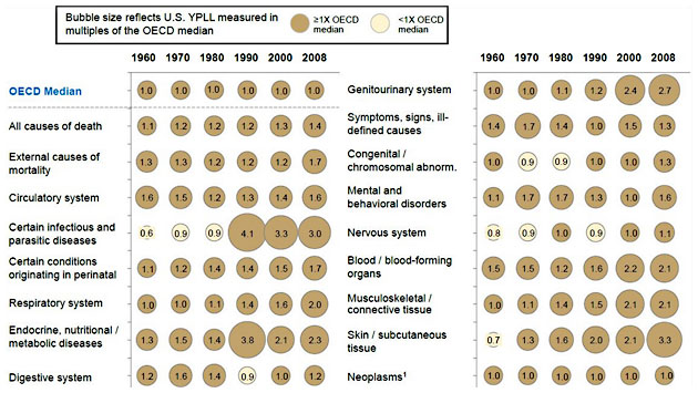
The dramatic thing about this chart is that the United States does worse than other rich countries in every single area. Sure, it’s possible that there are 16 different reasons that we’re doing worse in 16 different categories, but it doesn’t seem likely, does it? When something is this widespread, the cause is a lot more likely to be something broadly based, like health care delivery. This isn’t smoking gun proof that our Rube Goldberg health care system is responsible for our lousy life expectancy, but it sure ought to make you sit up and take notice. There’s a pretty good chance that you, your friends, and your family are going to live three or four years less than you should, solely because you live in America.

WE CAME UP SHORT.

We just wrapped up a shorter-than-normal, urgent-as-ever fundraising drive and we came up about $45,000 short of our $300,000 goal.

That means we're going to have upwards of $350,000, maybe more, to raise in online donations between now and June 30, when our fiscal year ends and we have to get to break-even. And even though there's zero cushion to miss the mark, we won't be all that in your face about our fundraising again until June.

So we urgently need this specific ask, what you're reading right now, to start bringing in more donations than it ever has. The reality, for these next few months and next few years, is that we have to start finding ways to grow our online supporter base in a big way—and we're optimistic we can keep making real headway by being real with you about this.

Because the bottom line: Corporations and powerful people with deep pockets will never sustain the type of journalism Mother Jones exists to do. The only investors who won’t let independent, investigative journalism down are the people who actually care about its future—you.

And we hope you might consider pitching in before moving on to whatever it is you're about to do next. We really need to see if we'll be able to raise more with this real estate on a daily basis than we have been, so we're hoping to see a promising start.

payment methods

We Recommend

Latest

Sign up for our free newsletter

Subscribe to the Mother Jones Daily to have our top stories delivered directly to your inbox.

Get our award-winning magazine

Save big on a full year of investigations, ideas, and insights.

Subscribe

Support our journalism

Help Mother Jones' reporters dig deep with a tax-deductible donation.

Donate