Charts of the Day: Which One Do You Believe?

Fight disinformation: Sign up for the free Mother Jones Daily newsletter and follow the news that matters.


Over at the motherblog, Kristina Rizga has an interesting piece about what happens when you try to integrate majority-black schools. Basically, nobody likes it. The poorer (mostly black) parents don’t like the idea of a bunch of rich folks coming in and pushing them around. The richer (mostly white) parents don’t like the idea of their kids going to a low-performing school. But Kristina points to a substantial body of research showing that, in fact, white kids do fine when they move to schools in poorer black neighborhoods. In fact, they might even do better on a variety of metrics.

The whole piece is worth a read, but because I’m a nerd I going to use it as an excuse for a statistics lesson. One of the links in the piece is to a recent report from the federal government about the black-white achievement gap. It contains three charts 
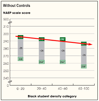
of note. The first is on the right, and it shows white test scores in schools with different densities of black students. Basically, it confirms the worst fears of white parents: as the percentage of black kids goes up, the test scores of the white kids go down.

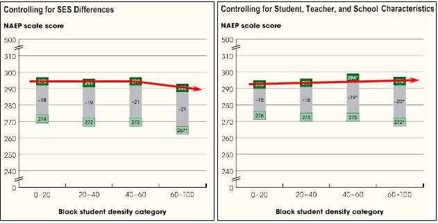
But wait. Maybe the white kids in majority-black districts are lower performing to begin with. So let’s control for income. That gets you the chart on the bottom left. Not so bad! Then let’s control for some other characteristics. Bingo! If we do a proper job of comparing apples to apples, white kids actually do better when they go to schools with very high densities of black students. White fears turn out to be entirely unfounded.

So here’s the question: which chart do you believe? The one with the raw data? Or the ones with all the fancy-pants statistical controls? Are the controls legitimate? Or are they just the result of a bunch of liberal analysts in the Department of Education torturing the data until they get the politically correct result they want?

Even statisticians might disagree about this. So how are laymen supposed to understand it? If you were a parent and these were your kids we were talking about, which chart would you believe?

WE CAME UP SHORT.

We just wrapped up a shorter-than-normal, urgent-as-ever fundraising drive and we came up about $45,000 short of our $300,000 goal.

That means we're going to have upwards of $350,000, maybe more, to raise in online donations between now and June 30, when our fiscal year ends and we have to get to break-even. And even though there's zero cushion to miss the mark, we won't be all that in your face about our fundraising again until June.

So we urgently need this specific ask, what you're reading right now, to start bringing in more donations than it ever has. The reality, for these next few months and next few years, is that we have to start finding ways to grow our online supporter base in a big way—and we're optimistic we can keep making real headway by being real with you about this.

Because the bottom line: Corporations and powerful people with deep pockets will never sustain the type of journalism Mother Jones exists to do. The only investors who won’t let independent, investigative journalism down are the people who actually care about its future—you.

And we hope you might consider pitching in before moving on to whatever it is you're about to do next. We really need to see if we'll be able to raise more with this real estate on a daily basis than we have been, so we're hoping to see a promising start.

payment methods

We Recommend

Latest

Sign up for our free newsletter

Subscribe to the Mother Jones Daily to have our top stories delivered directly to your inbox.

Get our award-winning magazine

Save big on a full year of investigations, ideas, and insights.

Subscribe

Support our journalism

Help Mother Jones' reporters dig deep with a tax-deductible donation.

Donate