<a href="http://www.shutterstock.com/pic-138707498/stock-photo-young-man-wipes-sweat-from-his-forehead-with-a-handkerchief.html?src=BWmPk3-mKxiPGK5hCSI9qg-1-5">ollyy</a>/Shutterstock
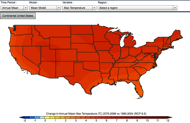
Climate scientists are fond of global models that try to answer how much the whole planet is going to warm up in a given time period. That’s all well and good, but it doesn’t do much for a mayor or city planner trying to prepare for the future in her own city. But a new map from the US Geological Survey (screenshot below) combines a group of the top climate models and matches them with high-resolution NASA climate data to project exactly how much hotter your county will be by the end of the century.
The map shows how temperature and precipitation will change based on your selection of a timescale (in a few years, a few decades, or by century’s end) and a future emissions scenario (higher or lower emissions). You can see averages for the whole country, individual states (minus Alaska and Hawaii… sorry y’all), and individual counties. My home of Pima County, Arizona, for example, will see a rise of 8.8 degrees Fahrenheit in maximum temperature but no change in precipitation in the longest-term, high emissions projection. The map shows some of the biggest changes are in store for the upper Midwest. Northern Minnesota’s Kittson County, for example, is in for a 10.6 degree F rise under this same scenario. (Because the map was made by scientists, all the temperatures are in Celsius; if you want to convert to Fahrenheit, remember that change in temperature uses a different equation than simply converting between units. There’s a good calculator here).
Temperatures like that won’t just make you sweatier: Climate policymakers at the UN have long agreed on 2 degrees C (3.6 degrees F) as the maximum threshold for avoiding the worst global impacts of climate change, including droughts and extreme storms. Steve Hosteler, the USGS scientist who designed the map, says that local officials could use the statistics to plan for future electricity use (hotter days means more A/C) and water drainage infrastructure (if more rain is the forecast).
While working to compile climate data on the US, he said, “it became pretty apparent that there was a need to take this data out of the modeling realm and make it useful for other people.”
If you have a favorite climate model (Anyone? Bueller?) you can toggle between 30 different ones developed by scientists across the globe, or simply look at the average of all 30. (The data I quoted above is from the multi-model average.) Other tabs allow you to see how quickly the temperature will rise between now and then, and even to see how much hotter each month of the year will be. And if you want to bring home the bad news to share with your folks over the holidays, you can download a PDF version of the map’s data. Happy exploring!