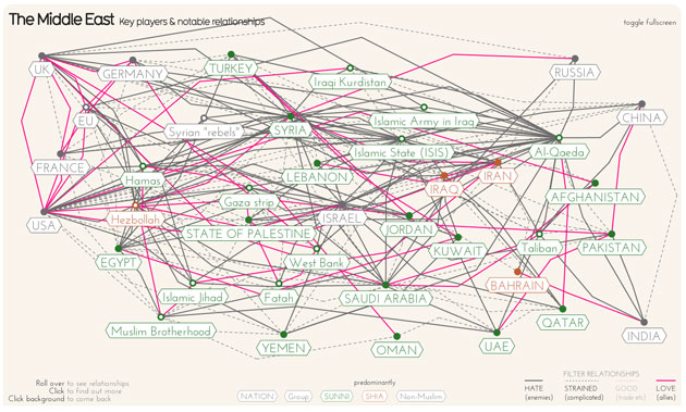
Behold, the Middle East! If we could just understand what all the strong countries, the falling-apart countries, the unrecognized-countries, the “non-state actors”, and the outside powers all thought of each other, we might be able to chart a clear way forward, right? Don’t get your hopes up, although the latest project by British data visionary David McCandless is a really valiant effort to make sense of it all nonetheless.
McCandless’ charted 38 regional players— from Afghanistan to Yemen, Al Qaeda to the European Union— and connected each to its major friends and enemies. The result is a tangled ball that illustrates the enormously complicated relationships in the region. (You can parse each actor’s relationships on the full, interactive version on McCandless’ site, Information Is Beautiful, which you should really check out.)
McCandless calls this work an “ongoing, evolving diagram,” so it may be missing a few connections (Russia’s close, getting closer relationship with Iraq, for instance). If you have more ideas, he welcomes input at the email address posted on his site.


