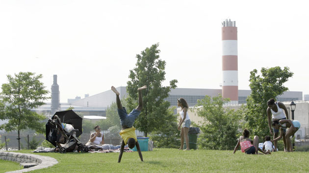
A sewage plant looms in the background of Barreto Point Park in the South Bronx.Mary Altaffer/AP
The environmental justice movement has been fighting the hazards and toxins disproportionately affecting poor communities of color for decades. Now it has a new tool.
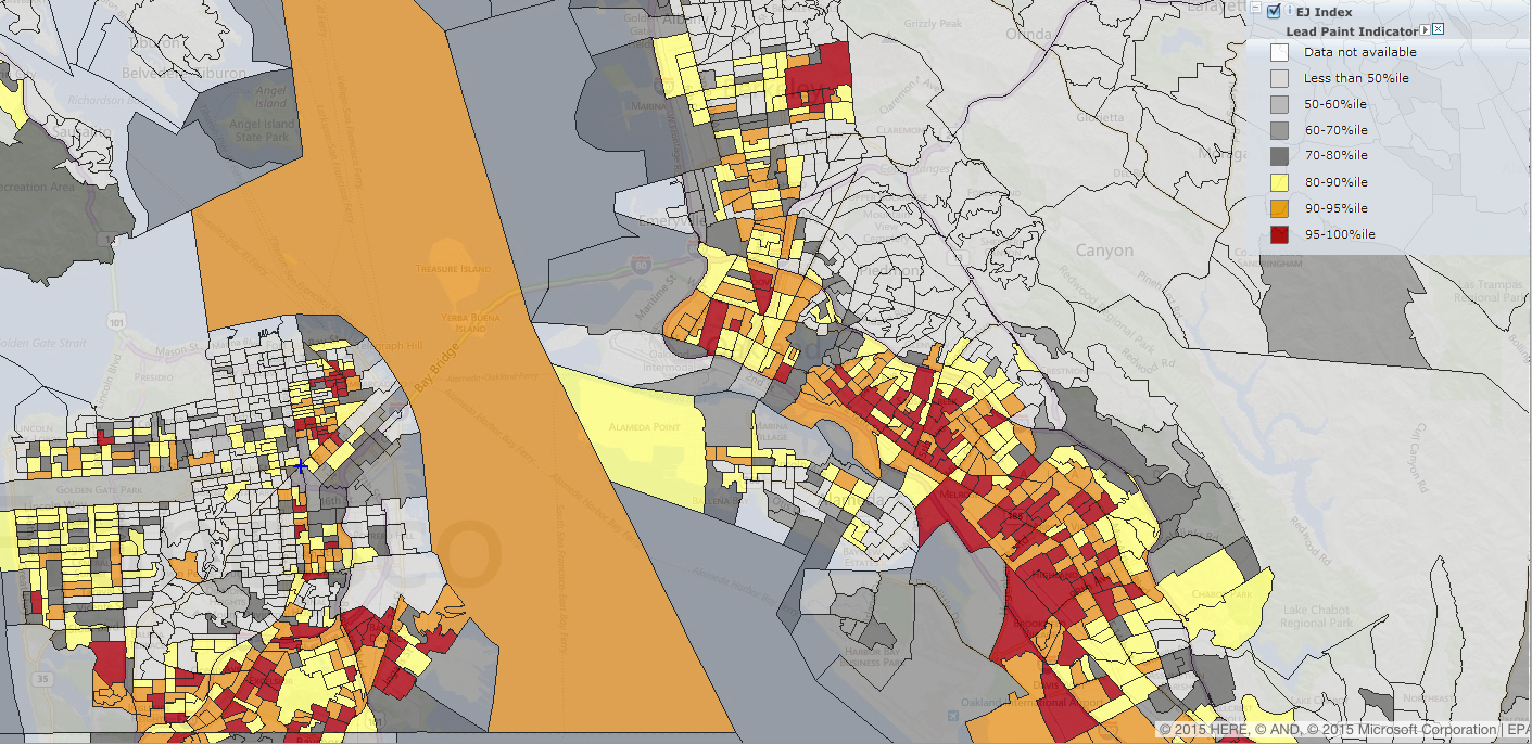
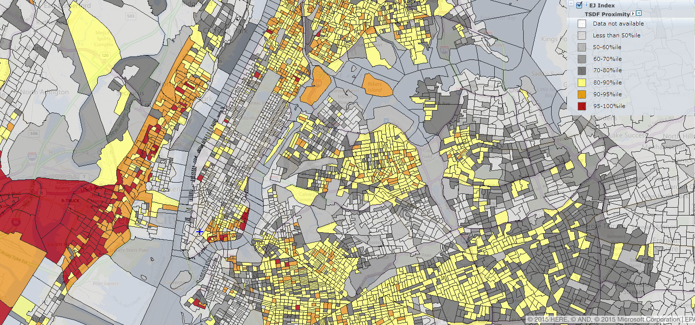
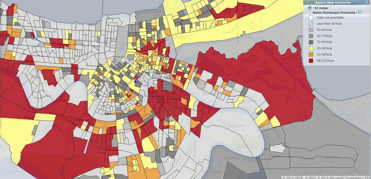
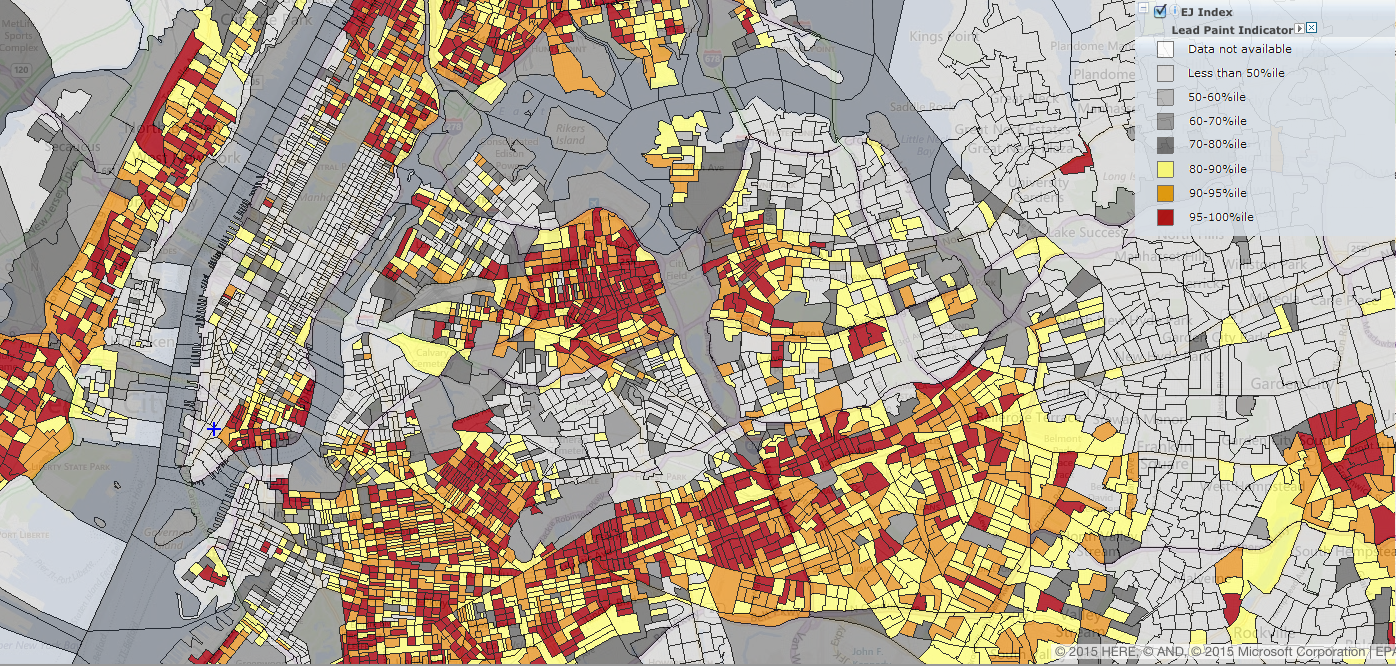
The US Environmental Protection Agency recently made public an interactive map that allows people to see how their communities’ exposure to hazardous waste, air pollution, and other environmental risks stack up with the rest of the country. “EJSCREEN” combines demographic data and environmental factors to create an “environmental justice index.” Environmental data includes vulnerability to air toxins and high particulate levels, exposure to lead-based paint, and proximity to chemical and hazardous waste treatment centers.
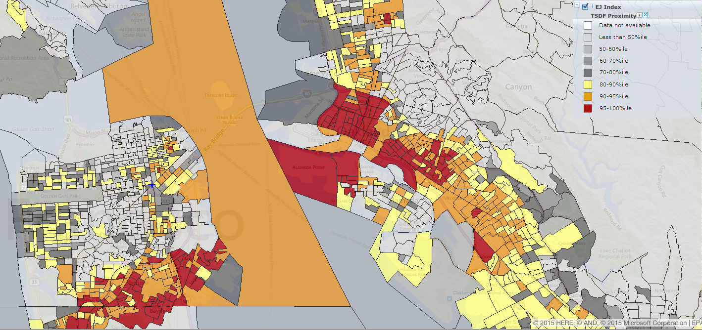
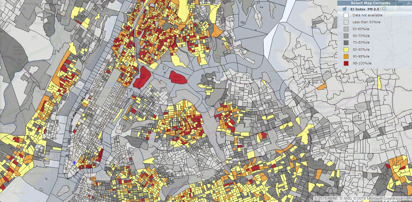
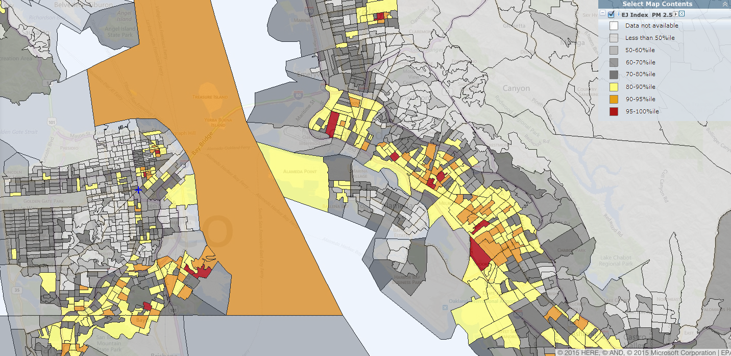
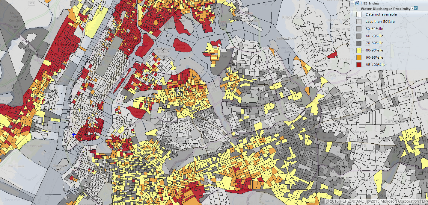
We started to explore the map, focusing on a few major cities. Not surprisingly, notoriously impoverished neighborhoods like West Oakland, the Bronx, and East New Orleans have the worst environmental justice indexes in many cases:
Hazardous waste:
New York City:
San Francisco Bay Area:
Air pollution:
New York City:
San Francisco Bay Area:
Water discharge facilities:
New York City:
New Orleans:
Lead-based paint exposure:
New York City:
San Francisco Bay Area:
