Donald Trump just announced 26 more pardons, and guess who he suddenly decided to include? Margaret Hunter! We get results around here.
Including Hunter, four women were on today’s list, accounting for 15 percent of the total.

Donald Trump just announced 26 more pardons, and guess who he suddenly decided to include? Margaret Hunter! We get results around here.
Including Hunter, four women were on today’s list, accounting for 15 percent of the total.
I was down in San Clemente yesterday, home of Richard Nixon’s famous Western White House, and decided to stroll around a bit with my camera. I mostly got intrigued by taking silhouettes of people against the sun, and this was my favorite. The crop makes it look like this guy is all alone against the vast Pacific Ocean, but actually the pier was pretty busy. Pictures really can lie, even if you’re not trying.


Nikolas Kokovlis/NurPhoto via ZUMA
In a new paper, a team of researchers looks at the effect of Twitter on the 2015 election in Great Britain. Overall, the news is good: “Twitter use led to higher levels of knowledge about politics and public aff airs, as information from news media improved knowledge of politically relevant facts, and messages sent by political parties increased knowledge of party platforms.” But I have to rate this as one of the most unintentionally funny sentences I’ve ever read in a research abstract:
But in a troubling demonstration of campaigns’ ability to manipulate knowledge, messages from the parties also shifted voters’ assessments of the economy and immigration in directions favorable to the parties’ platforms, leaving some voters with beliefs further from the truth at the end of the campaign than they were at its beginning.
Apparently, political parties stretched the truth in an effort to gain votes. Sacre bleu! Politics will never be the same again.
Jokes aside, this paper looks at evidence from 2015, which might as well be the Stone Age in social media terms. For that reason, it’s probably not very relevant to anything going on now. Still, it’s similar to more recent research, which tends to find that social media has a fairly limited effect despite the outsize attention it receives. For the most part, crackpot social media in the US seems to act primarily as an R&D arm of Fox News and conservative talk radio. Stuff swirls around the fringes of Twitter and Parler and Reddit and so forth, and mostly stays there unless one of the big guns picks it up. When that happens, it can take off. But it’s still the big guns that are the gatekeepers of this stuff.
Elizabeth Pancotti makes a good point on Twitter:
An average unemployed worker eligible for all 16 weeks of $600 FPUC, 11 weeks of $300 FPUC, 24 weeks of PEUC, and 20 weeks of EB would’ve gotten $29k from CARES and this new package in federal UI benefits and Democrats are really only taking credit for $1800 in checks.
— Elizabeth Pancotti (@ENPancotti) December 22, 2020
For some reason, headlines always focus on the value of one-time payments. Congress approves $600 stimulus checks! Trump wants $2,000!
But even the watered-down relief bill passed earlier this week provides a $300 unemployment bonus for 11 weeks. That’s $3,300, dwarfing the size of the stimulus checks. The CARES Act provided $600 for 16 weeks, or $9,600. But as near as I can tell, neither of these numbers ever made it into a headline.
That’s pretty crazy. Those unemployment bonuses alone have amounted to $12,900, aimed like a laser at people who have been furloughed due to COVID-19 and need it the most. These payments, far more than the one-time checks, are why the economy has remained in decent shape and savings rates have increased. Much of the money was spent, but much of it was put into savings and then drawn down over time, which kept consumer spending strong and rescued millions of families from destitution. It’s not quite right to say that this is a well-kept secret, but it’s not entirely wrong either. Why?
UPDATE: The conventional wisdom, I gather, is that one-time checks are popular because everyone gets them. Conversely, unemployment bonuses are unpopular because they mostly get paid out to people who aren’t me. This is why no one really wants to train a spotlight on the unemployment payments.
Sure. I guess. But are we progressives really so lame that we can’t manage to turn the unemployment benefits into a political positive? It’s not as if we can’t support the one-time checks too.
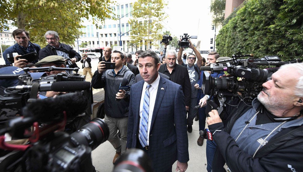
Rep. Duncan Hunter, the pride of the Marine Corps, after pleading guilty to using campaign funds to pay for his extramarital affairs.Denis Poroy/ZUMA
Two years ago Rep. Duncan Hunter and his wife, Margaret, were indicted on charges of using campaign funds for personal business, including housing supplies, tuition for the kids, a family vacation to Italy, and more. Duncan, a former Marine officer, immediately threw Margaret under the bus, claiming that she had been his campaign manager and he had no idea what she was up to. Prosecutors, however, allege that Duncan not only knew what was going on, but had used campaign funds to pay for five different extramarital affairs between 2010 and 2016.
In 2019 Margaret and Duncan both pleaded guilty. In 2020 Margaret, who had agreed to cooperate with prosecutors, was sentenced to eight months of house arrest, which she is currently serving. Duncan, who held out to the end and has been a vocal defender of Donald Trump, was sentenced to 11 months in prison starting in January. Two weeks ago, Margaret filed for divorce.
Yesterday, Trump pardoned Duncan, who will end up serving no time at all. Margaret is still under home confinement and has another four months left.
Boo yah.
POSTSCRIPT: In case you’re curious, Trump issued 15 pardons on Tuesday, all of them to men. He also commuted five sentences, three of them to women accused of small-time drug offenses.
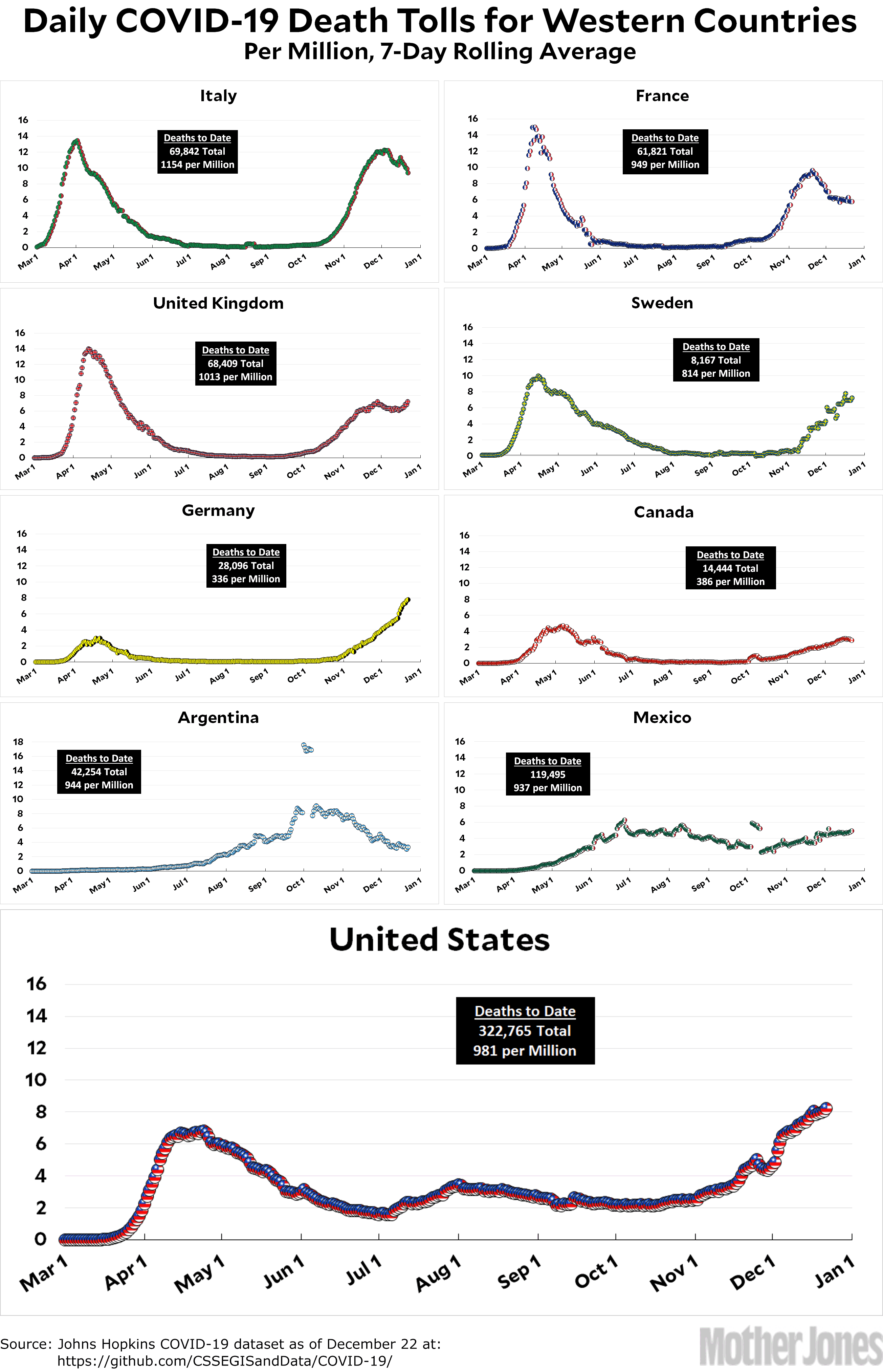
Here’s the coronavirus death toll through December 22. The raw data from Johns Hopkins is here.
As long as I’m in chart mode, here’s one for GDP growth during the pandemic. It shows roughly the same countries as the previous charts, namely our peer countries in Europe:
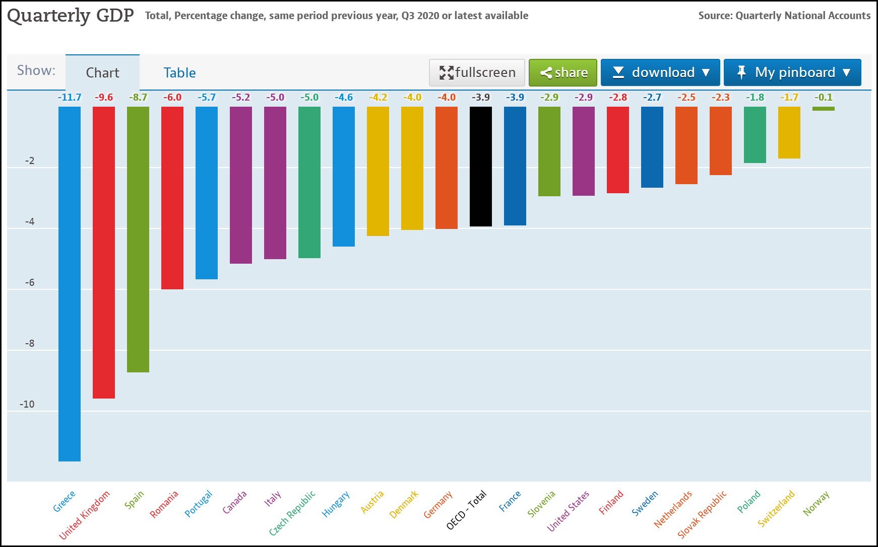
The United States is the purple bar. As you can see, we’re roughly in the top third, with a GDP decline of only 2.9 percent over the past year. Not the greatest, but not bad either. Better than France, Germany, Italy, and the UK anyway.
This is Union Station in Los Angeles. It’s also a demonstration of the limits of panoramic shots (and wide angle lenses). There’s no way to back up more than 30 feet from the front of the building, and that produces so much curvature that it’s impossible to fully correct. You can do a little bit, but not a lot.
You could get a non-curved picture by walking the camera from one end to the other, taking photos along the way, but that would require a different kind of stitching. I think that Photoshop can do this, but I’ve never had any luck with it. I suppose I should rtfm and find out for sure.

I don’t have any special reason for posting the following two charts, but I’m doing it anyway. The top one shows new COVID-19 deaths for the United States and every European country bigger than a few million people. The bottom one shows the same thing, but it’s cumulative deaths.
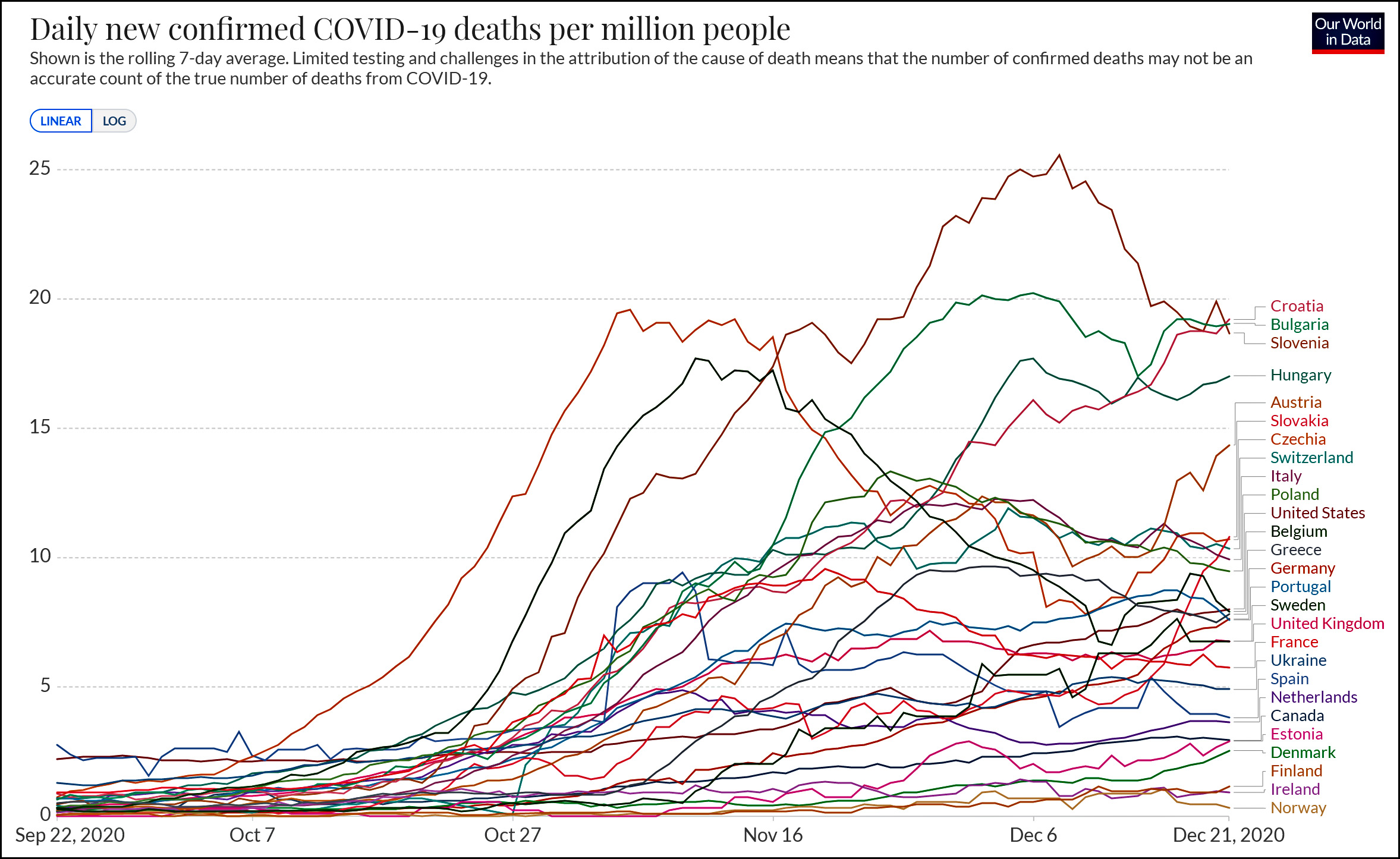
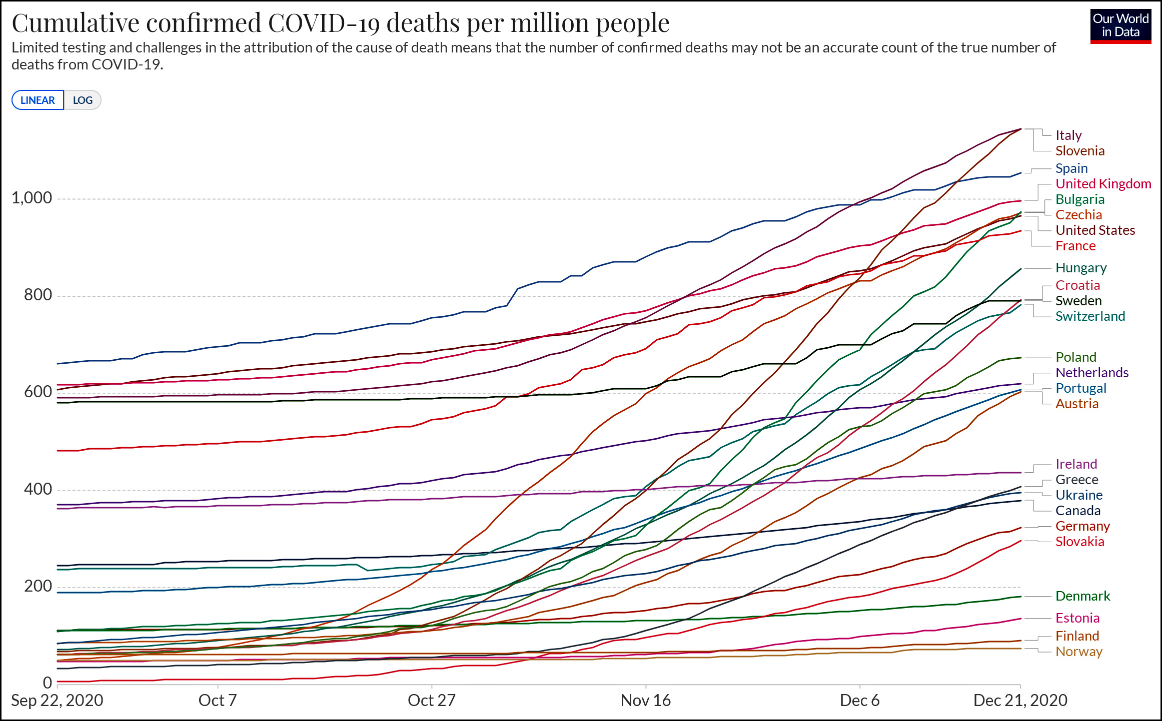
(In the bottom chart I omitted Belgium because who the hell knows what’s going on there? In any case, their numbers are allegedly so high that it wrecks the scale for everyone else. They are currently at about 1,600 deaths per million.)
Anyway, I suppose I do have a reason for posting these charts after all: to show you roughly where the United States stands on COVID-19 mortality compared to its peer countries in Europe. The answer, generally speaking, is that we’re high but not wildly high. It’s fashionable to pretend that the US response to COVID-19 has been disastrously, unconscionably bad, but that’s really not true. We could have and should have done better, but we’re not really all that different from other similar rich countries.
(Cases are a different matter. The US really does lead in the number of COVID-19 cases, but we also have a very low case fatality rate, which is why our death rate is not too far above the average. Is this because we test more people and therefore include more marginal cases? Is it because our health care is better? Is it because we skew younger than most European countries? Inquiring minds want to know.)
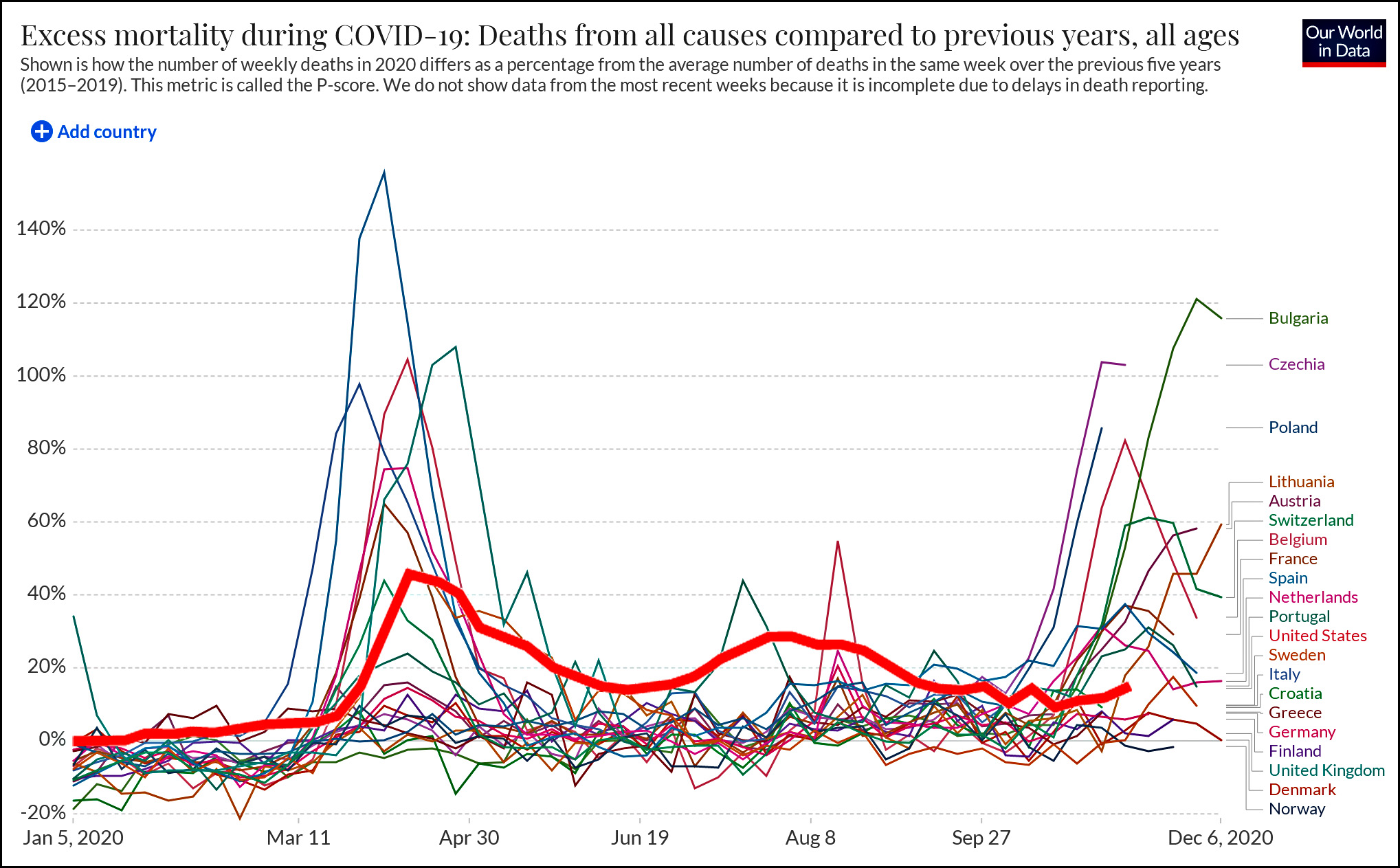
UPDATE: A reader emails to suggest that “confirmed deaths” might not be an accurate measure. The truth is that nothing is a completely accurate measure, and you can go down an endless rabbit hole trying to slice and dice the data. However, in this case we also have a measure called excess deaths, which is a calculation of how many deaths above normal various countries have recorded this year. As you can see, the US is no great shakes, especially during the summer, but generally speaking it’s still in the middle of the pack.
The Wall Street Journal reports that existing home sales were down in November. “Without a doubt, there are too many buyers in relation to the sellers,” said Lawrence Yun, NAR’s chief economist. “That is probably the main driver as to why the sales declined.”
I’m not sure this makes any sense—high demand would normally prompt more people to sell, wouldn’t it?—but put that aside. What you really need is some context. Here it is:
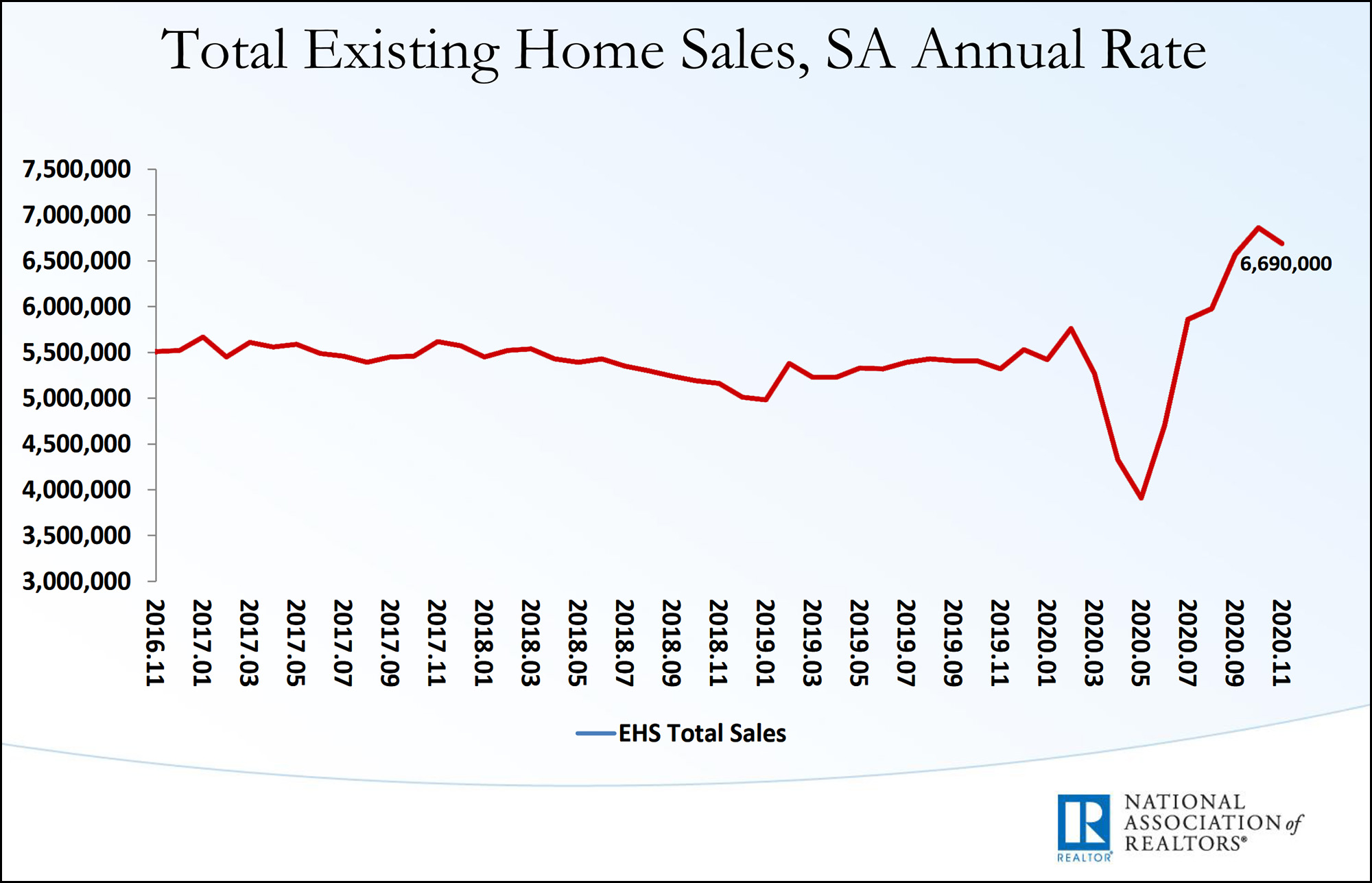
Yes, existing home sales were down slightly in November, but the general trend is nothing but upward in recent months: up 23 percent since the beginning of the year and up 14 percent since July. Does this mean that suddenly, on November 1, there were too many buyers? Nah. It just means there’s noise in the data series.
Plus, it turns out that home prices were down slightly in November, which suggests lower demand, not higher. But I’d venture to guess that’s just noise too.
For some reason, both reporters and their sources feel like they have to provide an explanation for everything that happens in the economy on a monthly, weekly, or even daily basis. This has been going on forever (“The stock market fell on news of an Elvis sighting in Paraguay”), and it’s ridiculous. If there’s a trend to report, fine. But a single blip is really unlikely to have much of a reason behind it. Everyone needs to stop pretending otherwise.