This post courtesy BBC Earth‘s Race to the South Pole series. For more wildlife news, find BBC Earth on Facebook and Posterous.
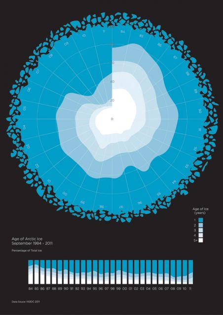
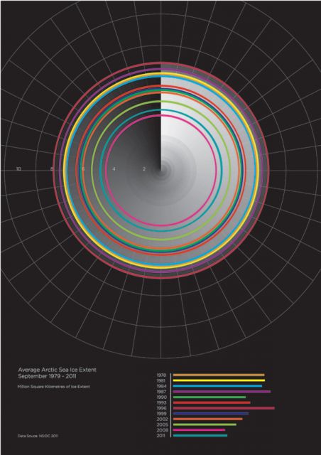
In early 2010, BBC Earth took a behind-the-lens look at some of the scientific information used to help make the BBC’s Frozen Planet series. Producers at the network’s Natural History Unit in Bristol led us to the findings of the National Snow and Ice Data Center, where sea ice scientists have been carefully analyzing the conditions of the Arctic’s frozen wilderness. We collaborated with designer Rupert Burton to bring this data to life. The two infographics below illustrate how the sea ice’s age and extent have fluctuated over the past 20 years, influenced by changes in weather, winds, and currents.
 The Age of Arctic Sea Ice (1984-2011): Data source: NSIDC 2011
 Average of Arctic Sea Ice Extent (1979-2011): Data source: NSIDC 2011
To learn more, visit the Icelights website, where you can read what sea ice scientists are currently talking about and ask them your own questions.


