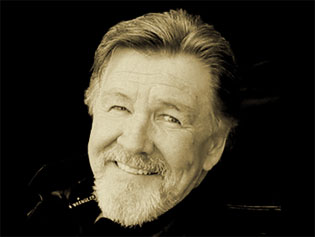
 Dugald Stermer, 1936-2011The careers of exemplary men and women can have a discouraging effect on the rest of us. Take the career of Dugald Stermer, who passed away on December 2. In his 74 years, he was nationally lauded as a designer and an art director and an illustrator and an educator. Is there anything this guy wasn’t acclaimed for? The man had a sandwich named after him at his favorite restaurant, for God’s sake! (I’ll get to that later.)
I’m Mother Jones‘ creative director, and I’ve been here for five years; so presumably somebody thinks I know what I’m doing. Still, sometimes, looking at a life like Stermer’s, it’s enough to make me want to take Fran Lebowitz’s advice to people in the throes of the creative urge: “Simply eat something sweet and the feeling will pass.” Just a few of the details of Stermer’s professional life will give you an idea of what I mean.
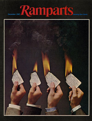 Ramparts, December 1967In 1964, Stermer was working as a design director in Houston when he was recruited to be the art director of the feisty Ramparts by Howard Gossage, an advertising executive who was advising the new publication. Stermer’s combination of restrained, classic typography with take-no-prisoners art direction helped position Ramparts as the contemporary antidote to stodgy progressive publications and gained him national prominence. The magazine soon became part of the national political conversation and was regularly criticized or lampooned in publications such as Time and Esquire (which at one point offered Stermer a job).
Sometimes this visibility had personal consequences: When Stermer and three other Ramparts staffers allowed their draft cards to be burned for the December 1967 cover, the four were called to appear before a federal grand jury in New York. But the magazine’s impact was felt much more widely than that. Dr. Martin Luther King was so moved by a Ramparts photo essay by William Pepper, depicting the effects of American military tactics on Vietnamese children, that he began speaking out publicly against the war shortly afterward.
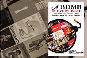
As an art director, Stermer was bold and self-confident, and he could be incredibly intransigent. When Ramparts editor Warren Hinckle tried to suggest changes in his first cover design, Stermer announced that he was going back to Texas. Hinckle backed down, and Stermer established a high degree of autonomy at the magazine. Nevertheless, his work was always in line with the magazine’s mission. According to Peter Richardson, author of A Bomb in Every Issue: How the Short, Unruly Life of Ramparts Magazine Changed America, for all its critical edge and irreverence, “Ramparts in its heyday was centrally concerned with the American ideals—and especially the nation’s failure to live up to them.”
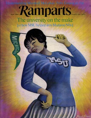 Ramparts, April 1966 Illustration by Paul DavisStermer left Ramparts 1970 (the magazine shut down in 1975), but his influence was felt even before that. In 1967, Ramparts staff writer Jann Wenner founded Rolling Stone, using elements of Stermer’s design for Ramparts‘ short-lived newspaper spinoff. And after working together at Ramparts, Adam Hochschild, Paul Jacobs, and Richard Parker started a publication initially named New Dimensions, but eventually called Mother Jones, in 1976. They recruited Stermer to consult for the fledgling muckraking magazine. He worked with founding art director Louise Kollenbaum, who created a classic yet bold typographic design which allowed the photography and illustration to really shine.
Stermer created illustrations for the early Mother Jones, including our first cover, which featured a racially integrated version of the iconic Archibald M. Willard painting, “The Spirit of ’76.” He did two other covers for us that year. Significantly, and unlike every other cover of that year and thereafter, his covers were image-only, with no headline text. Despite that, they communicate the magazine’s contents powerfully and provocatively; readers who saw his July 1976 cover, a painting of California’s then-governor Jerry Brown torn open to reveal Dwight Eisenhower, would have had no doubt as to what to expect inside.
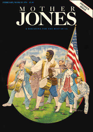 Mother Jones, February/March 1976 cover Illustration by Dugald StermerStermer continued to do editorial design work for publications including Harper’s and Sierra, but increasingly he made a name for himself as an illustrator. While he described the Mother Jones covers, which were done in three distinctly different styles, as a process of “finding myself as an illustrator,” he soon developed the distinctive combination of precision and dynamism by which his work became widely known. His illustration won awards and medals from all the major societies. He worked for most of the top publications, including Time and Esquire. His mature illustration work was meticulously researched and flawlessly executed.
I was lucky enough to work with him on a story on East Bay Birds for Diablo. I experienced a touch of the firmness which was a hallmark of his Ramparts days, but he was unfailingly respectful, he could always back up his opinions, and the work was gorgeous. He was an expert illustrator of nature and did illustration for Audubon, as well as publishing three books of his naturalist work.
Beginning in 1989, Dugald began teaching illustration at the California College of the Arts, and in 1994 he became the chair of its illustration program; he held the title of distinguished professor. He headed a strong and diverse group of instructors. Over the years the staff included Owen Smith, John Hersey, and Caitlin Kuhwald, all of whom have contributed to Mother Jones. In keeping with his own love of autonomy, he supported their decisions and their unique styles of teaching illustration. And while he could be intimidating, and frighteningly blunt in critiques, students soon found out that it was all in service to the development of their work.
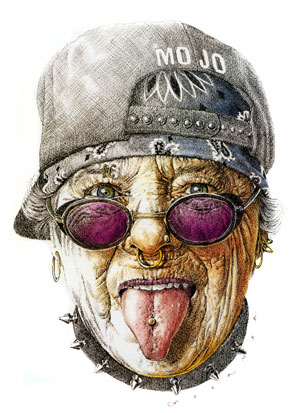 Mother Jones, the hellraiser reimagined, for “Radical Mama,” in the November/December 1998 issue of Utne Reader Illustration by Dugald Stermer For more than 30 years, Stermer served on the board of the Delancey Street Foundation, a residential program for former substance abusers, ex-convicts, and homeless people. Stermer was well known and loved there; his studio was even located on the premises, in a building complex built by, maintained by, and lived in by the people who went through the program. He often ate lunch in the café run by the foundation, where the menu featured Dugald’s Grilled Ahi Tuna Sandwich (with wasabi aioli and a kaiser roll).
Beyond all these accomplishments, Stermer made a great impression on those who came in contact with him. Here’s what a few of them had to say:
“Dugald had superb, elegant taste, and also a sense of what was necessary to reach a wider audience. An all-too-rare combination.” —Adam Hochschild, cofounder of Mother Jones
“Ideas were very important to him. He wanted students to contribute their life, thoughts, and knowledge to their illustration work. He constantly said that his class was for the most part, ‘a class teaching you to think.'” —Alexis Mahrus, assistant chair, CCA illustration program
 Mother Jones, July 1976 cover Illustration by Dugald Stermer“I have a lot of respect for his tenacity and his stubbornness, and his willingness to stick to a vision.” —Richard Parker, cofounder of Mother Jones
“I credit Dugald’s brilliant art direction at Ramparts magazine for teaching me how to be an editorial art director. He taught me to think like an editor as well as an art director, and that has served me throughout my career.” —Louise Kollenbaum, founding art director of Mother Jones and author
“Brilliant at pretty much everything he did.” —Mark Dowie, former publisher and editor of Mother Jones
So: pretty intimidating. But also pretty darn inspiring. To the readers of Ramparts, including Dr. King. To the Delancey Street Foundation’s staff and clients. To his students and fellow teachers. And to the founding staff of Mother Jones, to whom he imparted a sense that visual communication is an important part of the “smart, fearless journalism” that we do. That sensibility has become part of the culture here to the present day.
So in one way he’s made my life harder by raising the bar so high. But in another, he’s made it easier by demonstrating the worth of the work that I do.
Thanks, Dugald!
