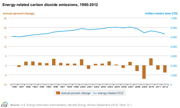
One of the next big items on President Obama’s green agenda is a new set of caps on greenhouse gas emissions from power plants. Set to roll out over the next few years, the rules aim to slash the climate impact of the nation’s biggest polluters. But statistics released yesterday from the federal Energy Information Administration show that even without these new caps, energy-related carbon emissions—those that come from powering factories, homes, cars, and businesses—dropped almost four percent between 2011 and 2012, marking the fifth out of the last seven years for these emissions to decline:
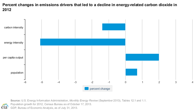
Overall energy consumption fell by 2.4 percent last year, even as the GDP grew by 2.8 percent. That translates to a 5.1 percent drop in energy use per dollar of GDP. In other words, businesses are finding that they can use less energy (and/or cleaner sources of it) and stay productive. In the chart below, carbon intensity refers to the carbon emissions per dollar of GDP; energy intensity is energy use per dollar of GDP (the 5.1 percent drop just mentioned). So even as population and per capita output are growing, the amount of electricity use and carbon pollution tied to that growth are dropping:
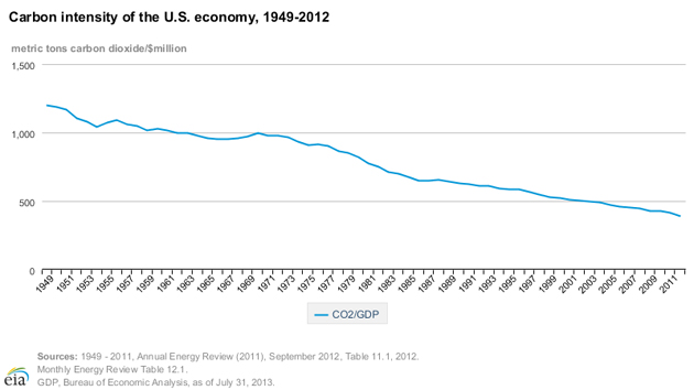
This is great news, but it’s not really new: Here’s another way to look at carbon intensity, which shows how energy efficiency has given us more and more carbon bang for our bucks over the last 60 years:
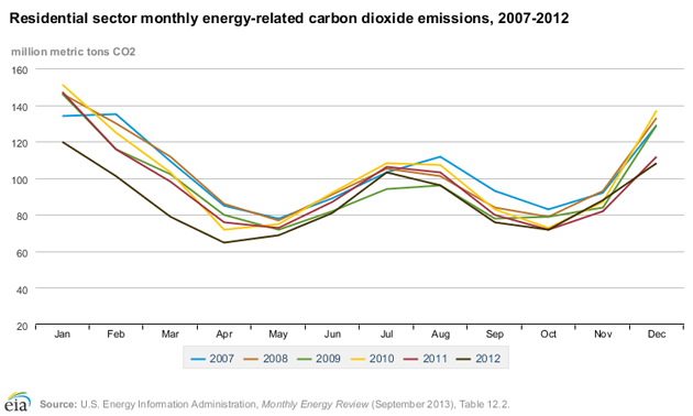
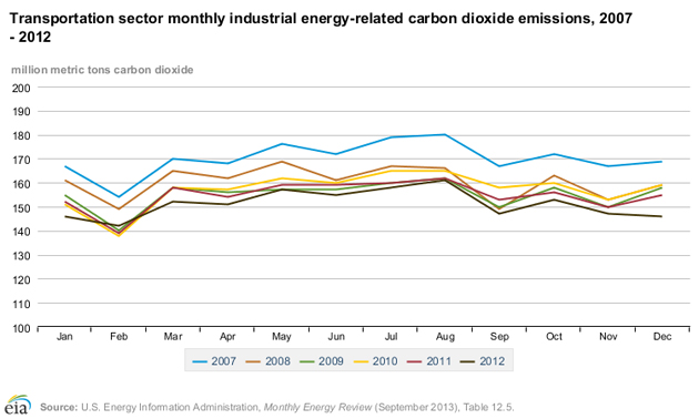
So what’s behind last year’s drop? To start, give yourself a pat on the back: Half the cuts came from reductions in household energy use. Ironically, we might have to thank climate change for that, as the biggest reductions came at the start of the year when the US was in the midst of its fourth-warmest winter on record—the EIA’s metric of cold days when heating might be required was down nationwide 19 percent below the 10-year average and 22 percent below 2011. The dark brown line below is 2012; notice how far beneath the other lines it is on the left-hand side:
Fuel-efficiency gains for vehicles also played a major role: Even though total miles traveled by cars in the US was the same between 2011 and 2012 (~8 billion miles per day), carbon emissions were down thanks to the growing number of fuel-efficient cars on the road:
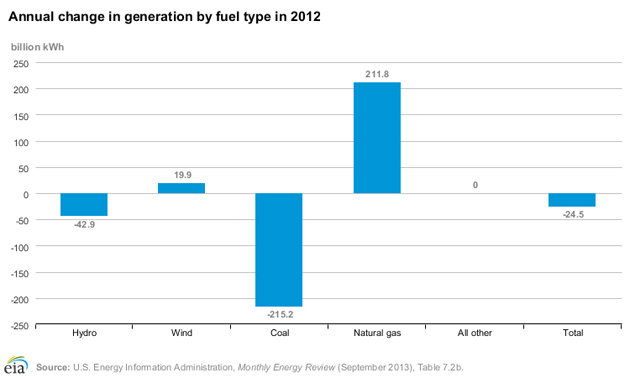
Last but not least, the energy we’re still using is coming from cleaner sources—like wind, up almost 20 percent—bringing the overall carbon intensity of electricity generation down by 3.5 percent. The drop in hydro power, EIA analyst Perry Lindstrom said, reflects a return from a particularly high-producing previous year, driven by the amount of water in rivers rather than the construction of new infrastructure, as in the case of wind.
“We’re not building big hydro plants in the US,” he said. “Everything that happens in hydro is driven by precipitation and snowmelt.”
Although 2012 saw severe drought across much of the country, the drought was less pronounced in the Pacific Northwest where the bulk of the country’s hydro plants are, so it’s unclear whether climate might have played a role here as well.
Solar doesn’t appear on the chart because it is lumped in with other sources, including nuclear and geothermal, that saw little change between 2011 and 2012.
But by far the most significant source of reductions came via the substitution of natural gas, made relatively cheap and abundant by fracking, for coal. This chart makes it plain how concerns about fracking, from groundwater contamination to earthquakes to methane emissions, need to be balanced against the massive bite it takes out of much more carbon-intensive coal, although some experts worry that long-term reliance on natural gas could also loosen the market foothold of renewables:
